Architects’ Journal
From 2009 to 2016, my team and I designed over 350 issues of AJ, mostly in print, but also in digital editions. I managed bespoke publications for Hopkins Architects, V&A and Westfield – that were issued with the magazine. Also designed were small to medium scale exhibitions for AJ Small Projects, Kiosk and Sinan at New London Architecture, and in Bologna, Italy.Case study details
︎ Editorial art direction
︎ Print management of weekly magazine
︎ Design of digital issues
︎ Digital design
︎ Illustration / typography commissions
︎ Exhibition design
︎ Team management
︎ Editorial art direction
︎ Print management of weekly magazine
︎ Design of digital issues
︎ Digital design
︎ Illustration / typography commissions
︎ Exhibition design
︎ Team management
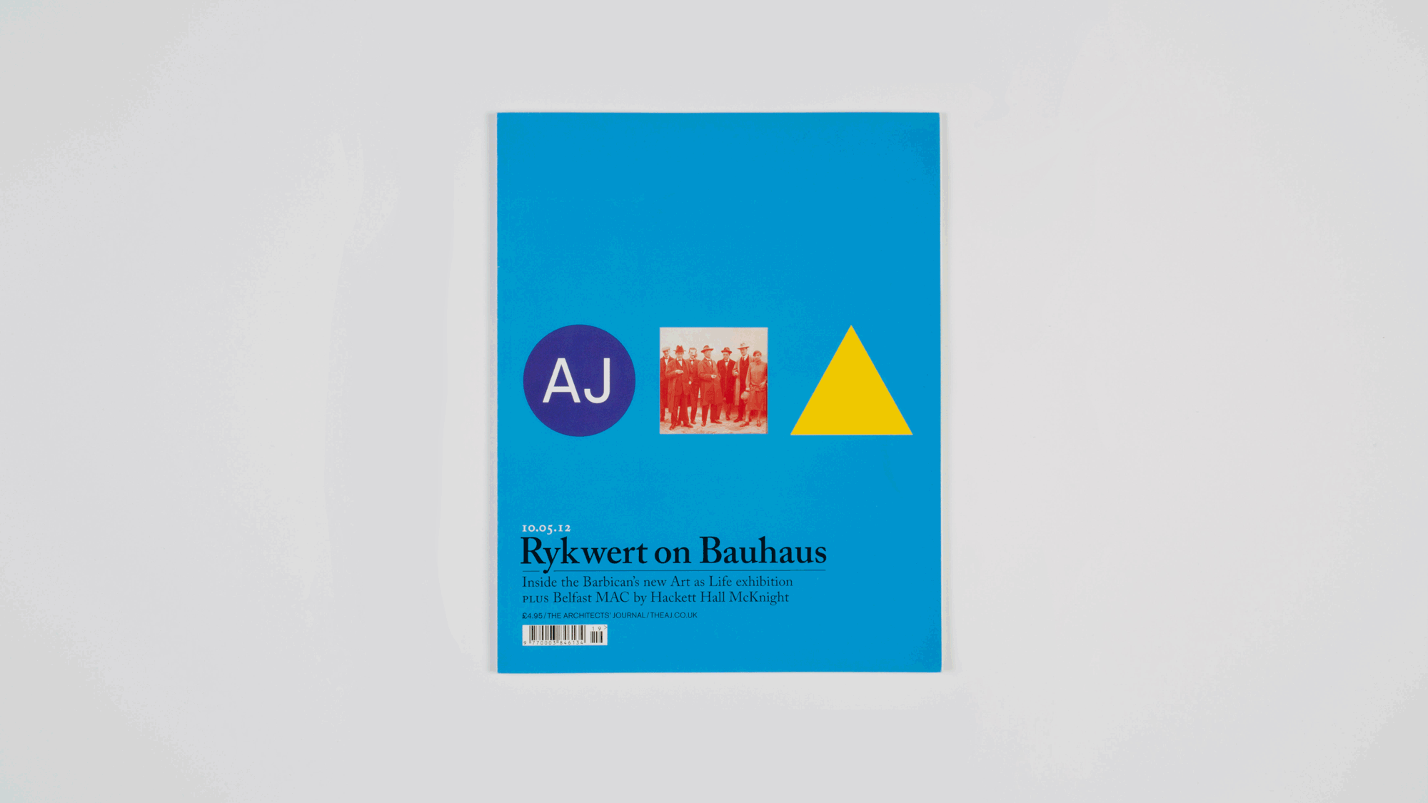 ︎︎︎ Die-cut cover, revealing a portrait of Bauhaus teachers and members. The inside front cover advertising was adjusted to enable this special issue hommage to Kandinsky, Gropius and Breuer.
 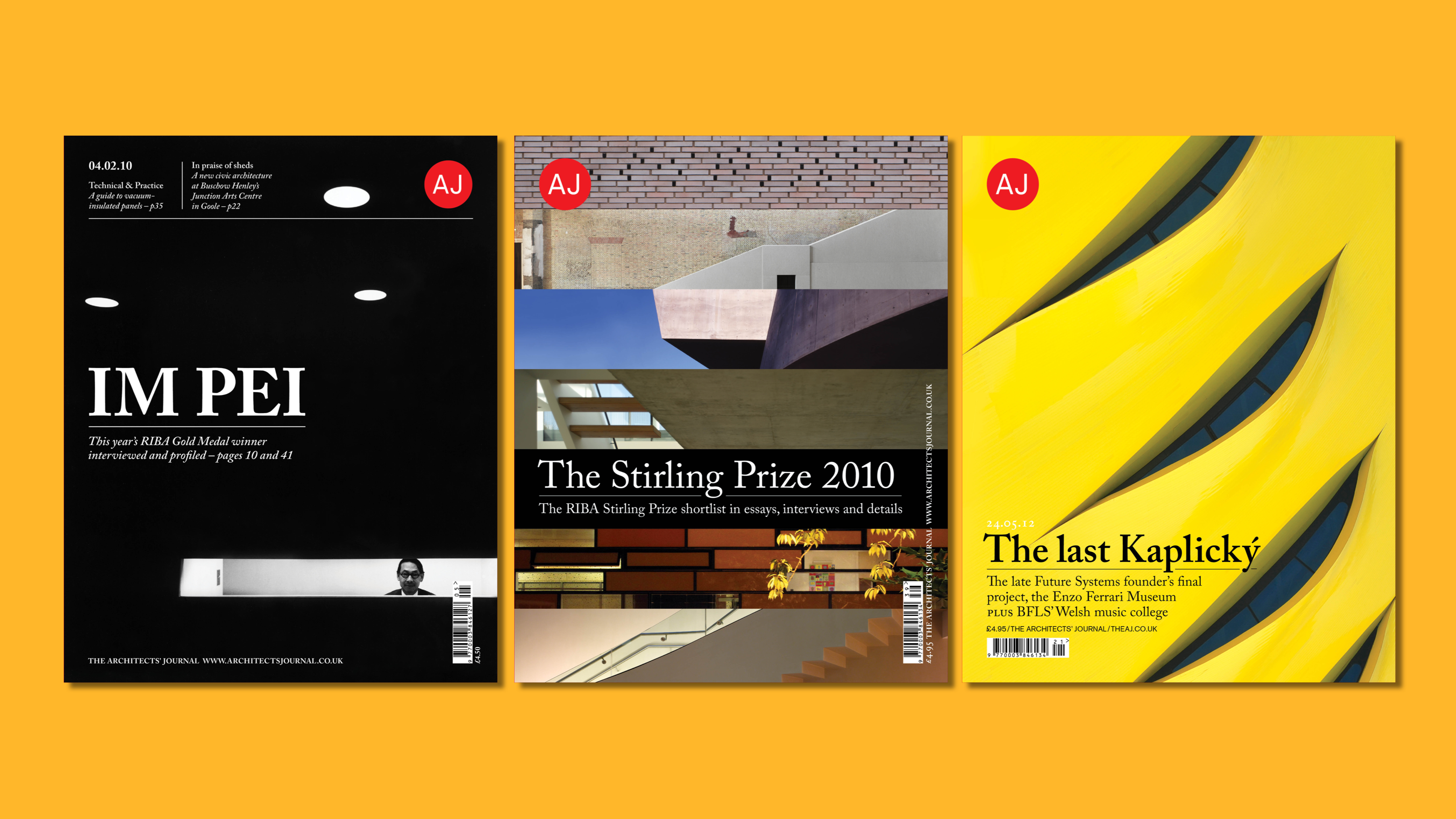 ︎︎︎ (L-R) IM Pei photographed in the 1960s by Arnold Newman. Stirling Prize abstract jigsaw. Detail of Enzo Ferrari Museum facade.
 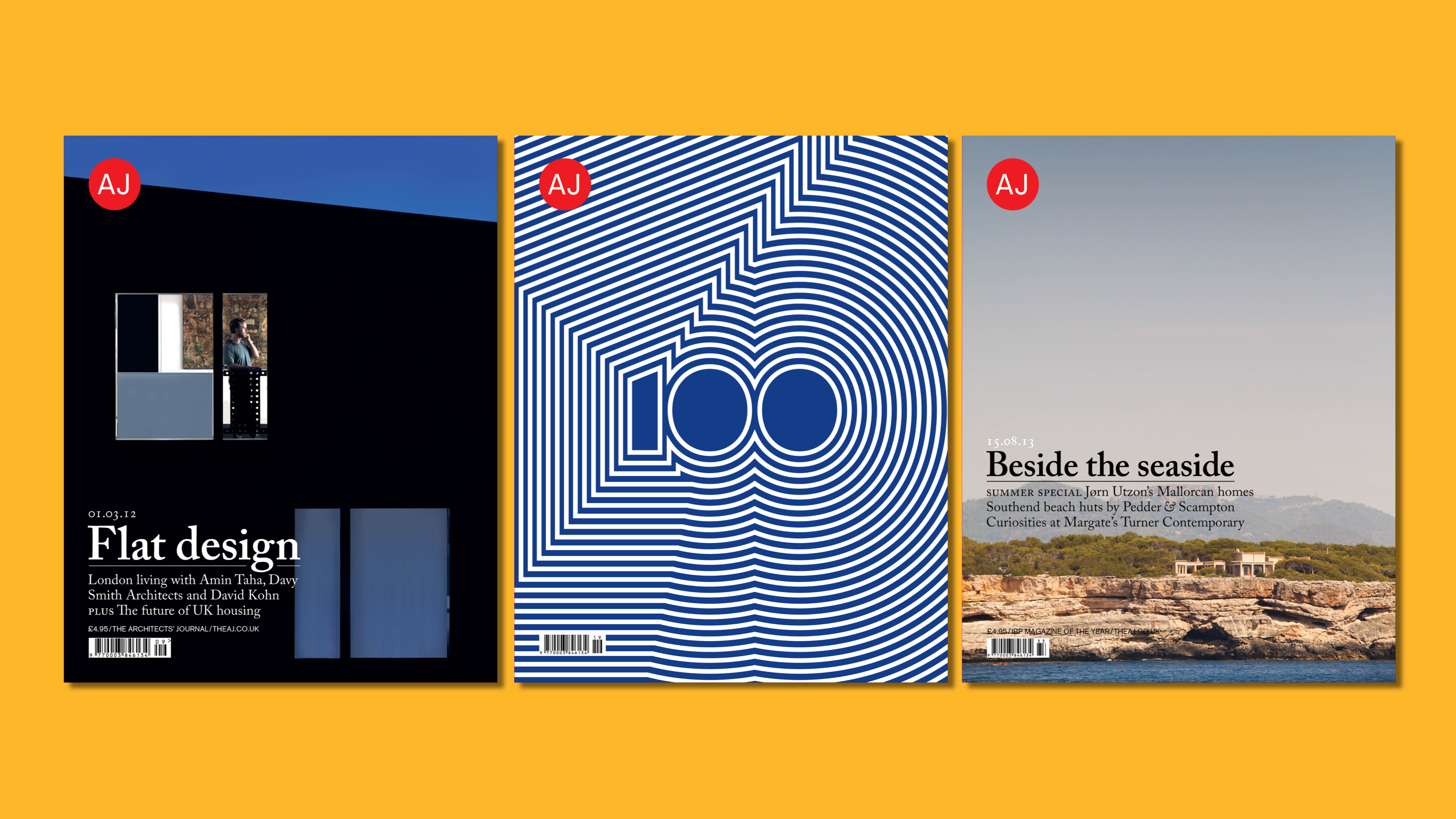 ︎︎︎ (L-R) Debut of a new, softer typographic system, photo by Charles Hosea. AJ100 graphic by Sosuke Suguira. Jørn Utzon in Mallorca, photographed by Anthony Coleman.
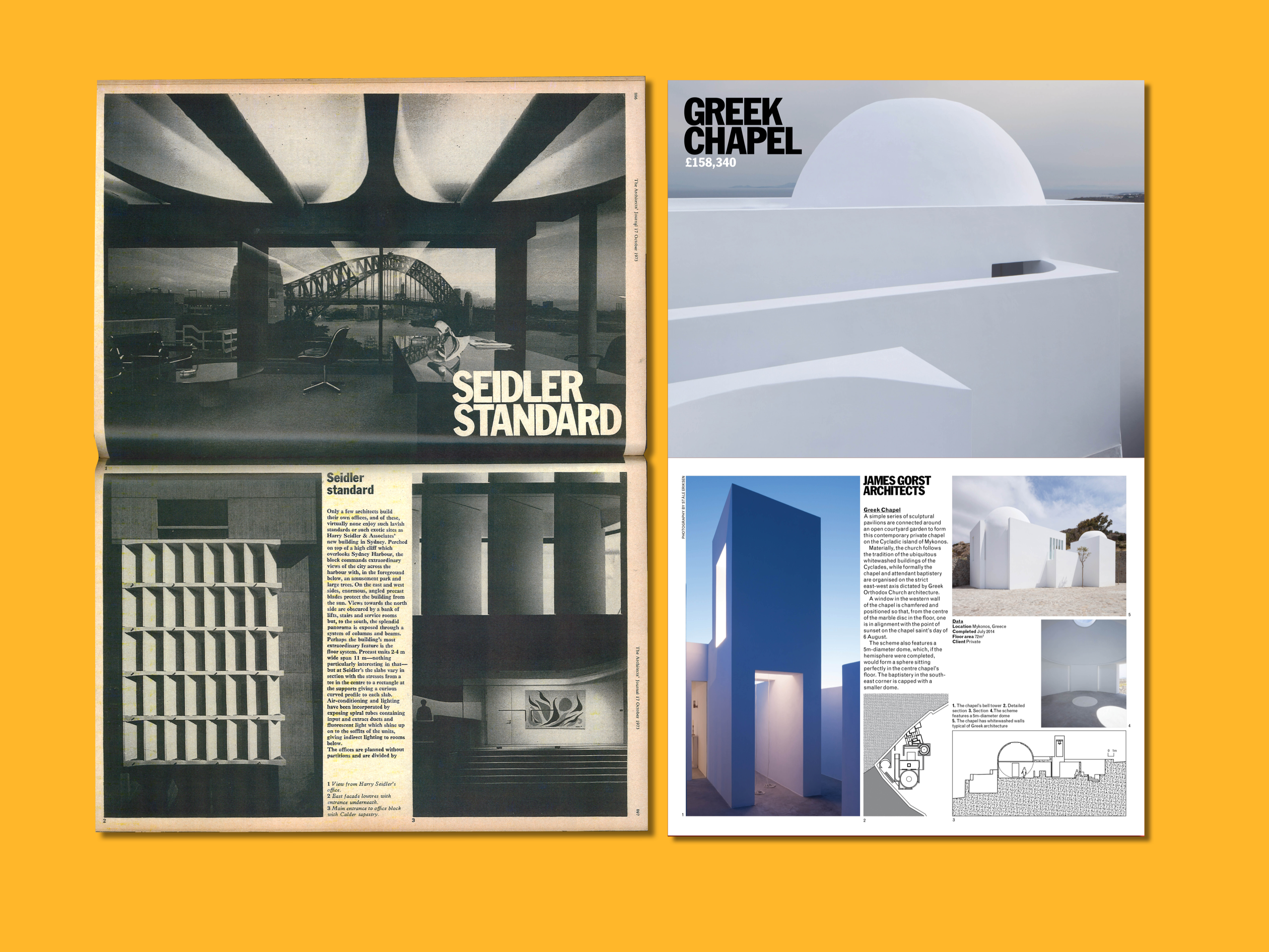 ︎︎︎ Architecture is landscape ... a rotated 1970s AJ spread, with Franklin Gothic Condensed as headline font. I reintroduced the typeface, and commissioned Phil Baines to set it how it looked in the past—with tight hairline letterspacing—as part of a full redesign of the magazine in 2015.
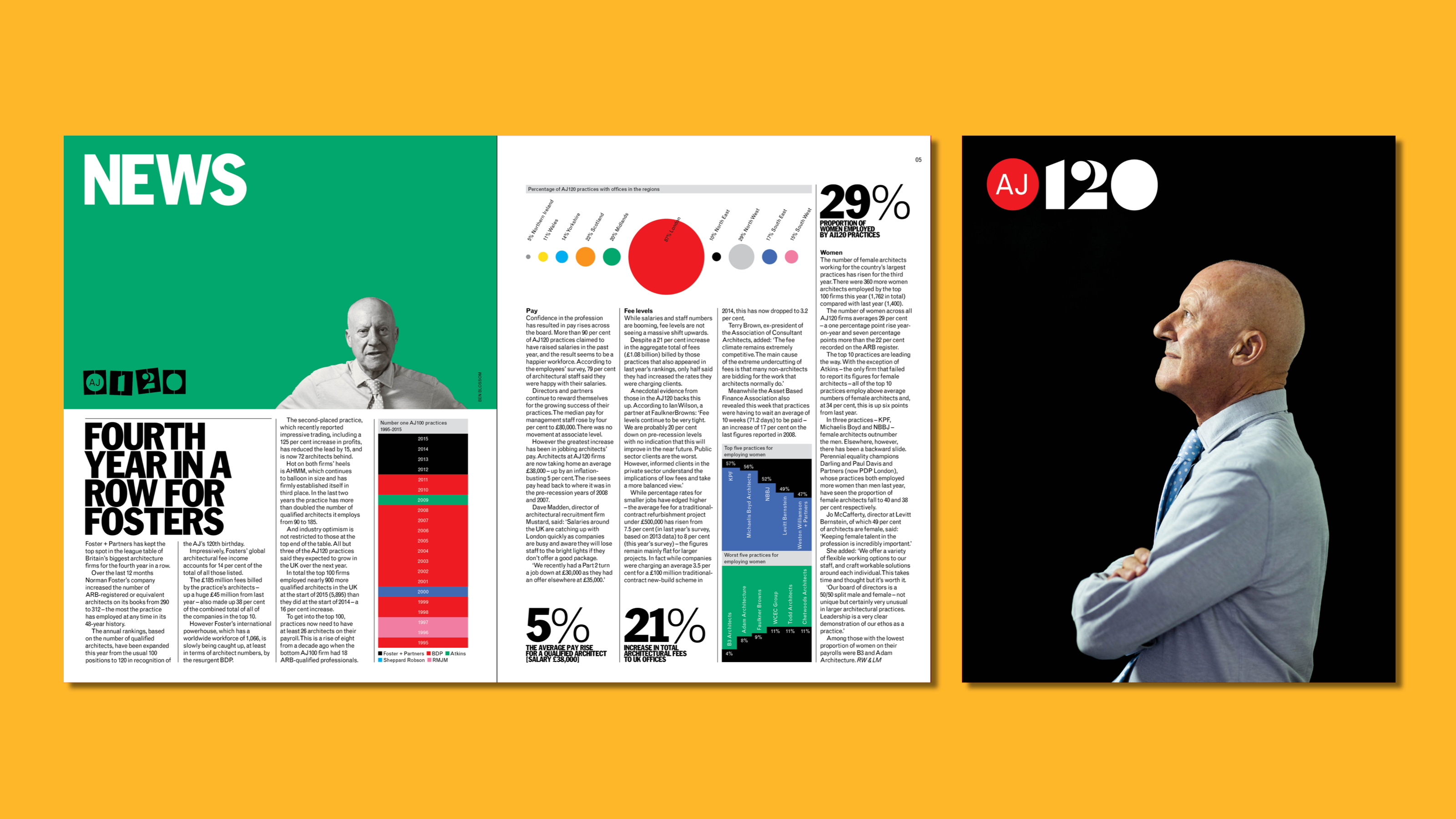 ︎︎︎ AJ100 news spread with infographics, Norman Foster portrait by Ben Blossom.
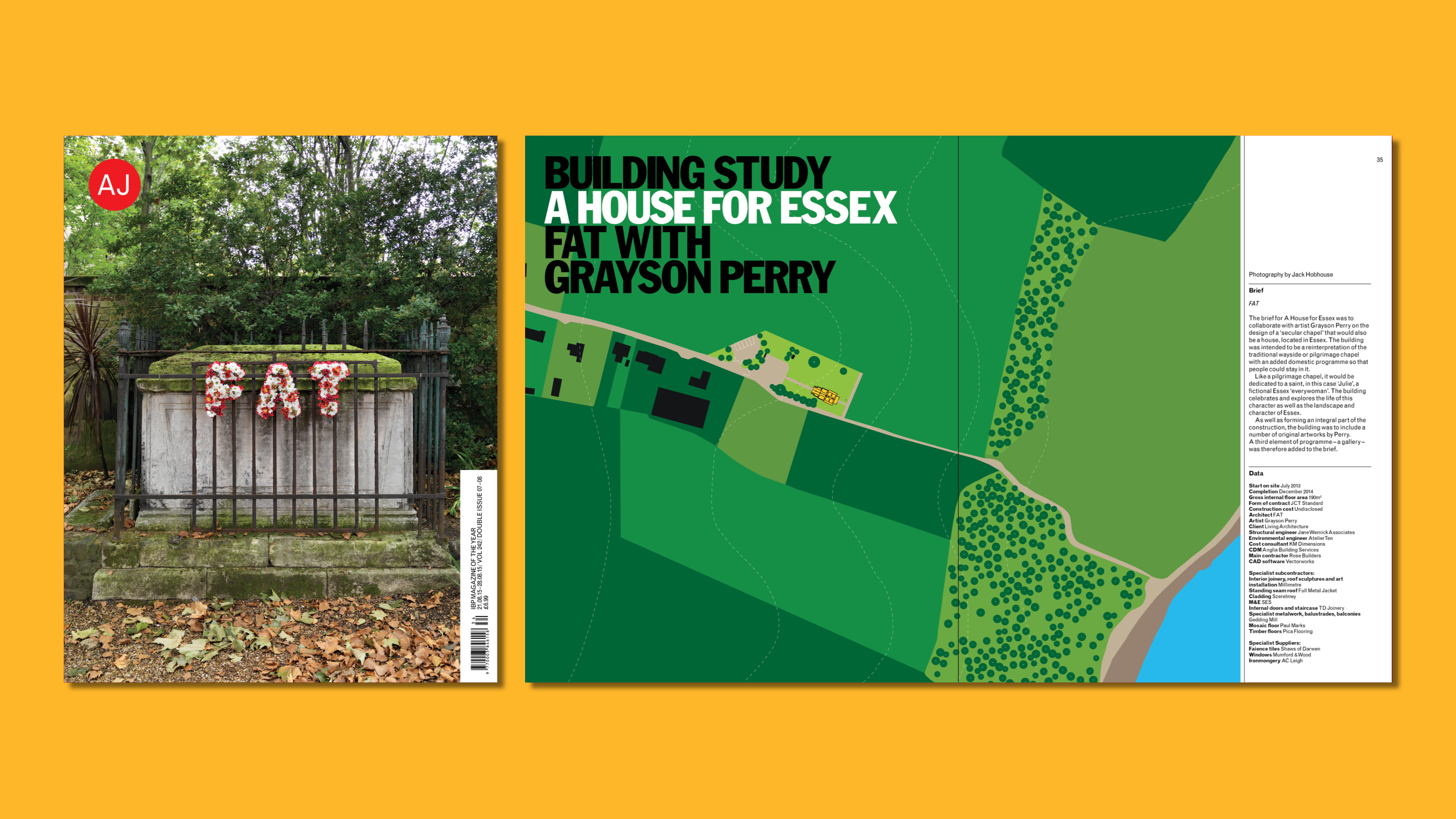 ︎︎︎ Special issue guest edited by FAT, cover photography by Charles Hosea.
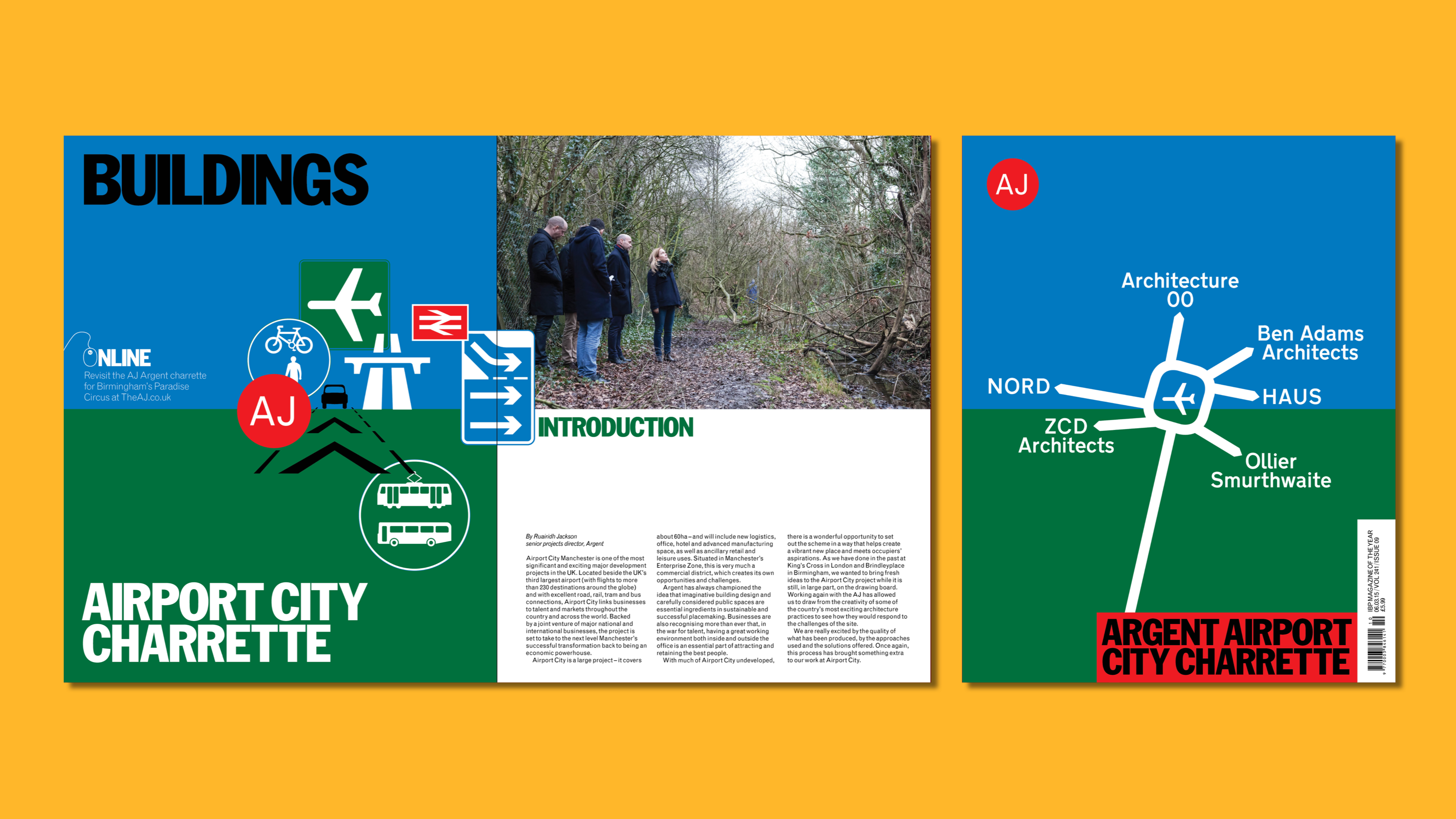 ︎︎︎ Charrette issue, using Margaret Calvert and Jock Kinneir’s Transport typeface on the cover.